Color Realism vs. Black and Grey: Which Is Right for You?
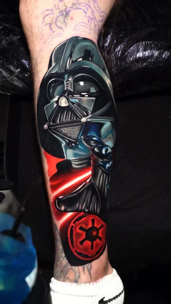
Color realism vs. black and grey is one of the first decisions when planning a realistic tattoo. Both styles can be stunning, and there is no single right answer. Here is how they differ, why I work in color, and how to decide which one is right for you.
What is color realism?
Color realism recreates a subject with volume, light and texture using a full range of colors. Characters look almost three-dimensional, with saturated tones and smooth transitions. It is the style I specialize in.
What is black and grey?
Black and grey tattoos build the image with black ink and shades of grey. They rely on contrast and soft shading to create depth, without any color.
Why I chose color realism
I chose color realism because I have been drawing and painting in color since I was a kid. It is something I really enjoy, and it fits the characters I love to tattoo: comic heroes, villains, cartoons and video game icons, all born in bright color.
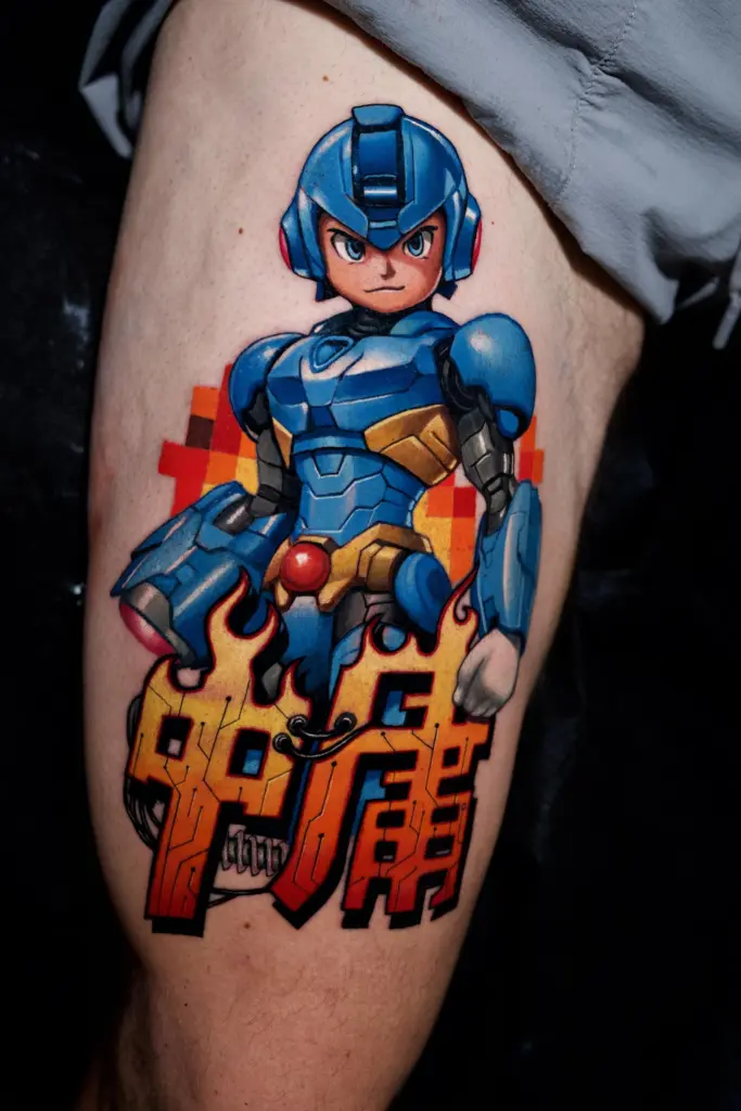
Black is still the base of color realism
Even in a color piece, black plays a key role. Black makes the colors pop and gives depth and volume to the character. I work from dark to light, and on the second session I add the details.
Color realism vs. black and grey: how to choose
My recommendation is simple: choose the style you like the most, and let your artist guide you to adapt the design and the contrast to your skin tone. A few questions can help:
- What does the character look like in your memory? Many comic and cartoon characters are defined by their colors.
- What mood do you want? Color feels vibrant and playful; black and grey feels more dramatic and timeless.
- What do you already have? Your new piece should work next to your other tattoos.
Examples from the gallery
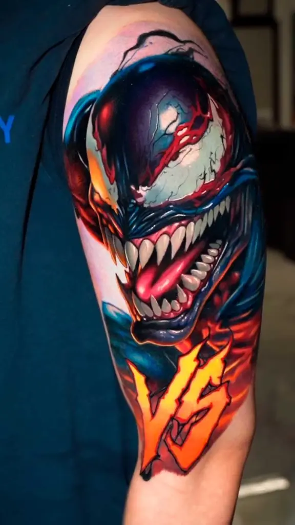
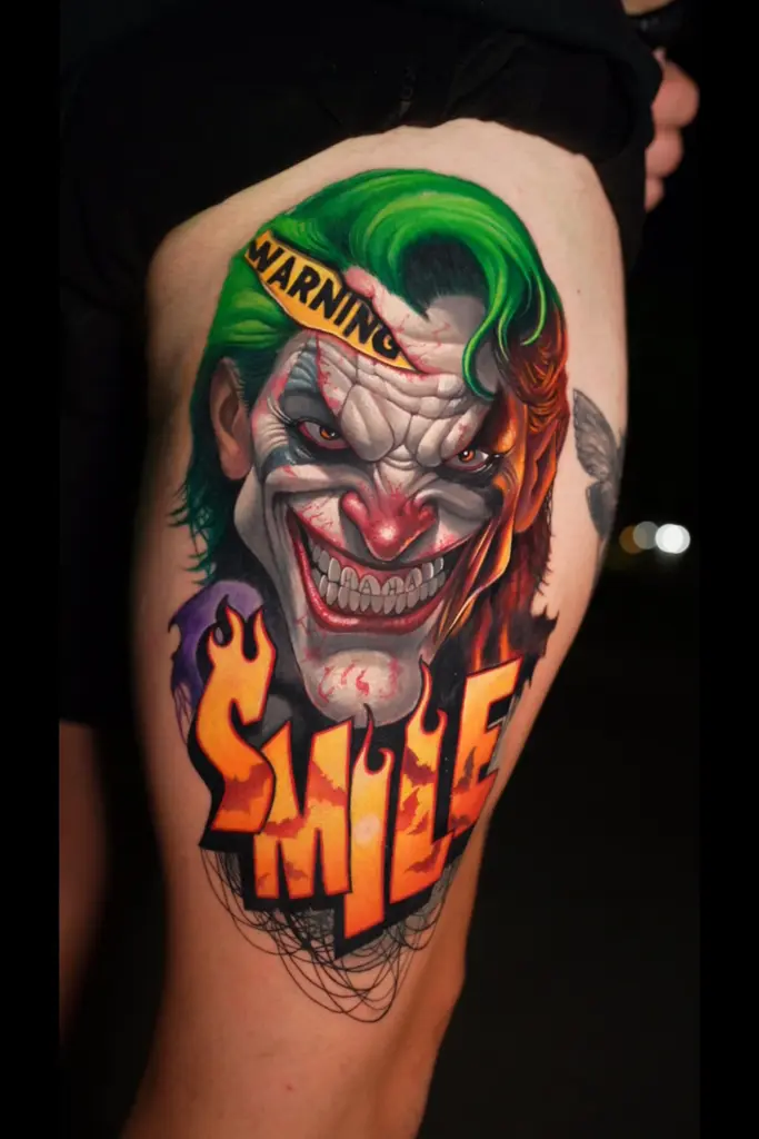
Dark characters show how black and color work together: deep shadows frame the bright areas and make them glow.
Can you combine both?
Some designs mix darker, almost monochrome areas with touches of bright color to make the main character stand out. If you like both looks, tell me during the consultation and we can find the balance that works for your idea.
Your skin tone matters
Every skin is different. On darker skin tones, I adapt the design and the palette, using fewer gradients and looking for clear contrasts. Depending on the project, I can also suggest black and grey. What matters is evaluating each skin and being clear about the result we can achieve.
Questions to bring to your consultation
- Which version of the character do you have in mind, and what colors define it?
- Do you want the piece to feel bright and playful, or darker and more dramatic?
- How does the new tattoo need to work next to the ones you already have?
- How visible do you want it to be in your daily life?
Bringing these answers makes it much easier to decide between the two styles together.
Keeping color bright for years
Color tattoos age well when they are cared for. Once your tattoo is fully healed, use a high-SPF sunscreen and cover it whenever you can. If a piece needs a touch-up once it has healed, I do it, and it is included in the price. Read more in our tattoo aftercare guide.
Still not sure?
Tell me your idea and send a photo of the area through the booking form. We can talk about color realism vs. black and grey during the consultation and choose what works best for your piece and your skin. I work at Garden Ink NY in Manhattan.